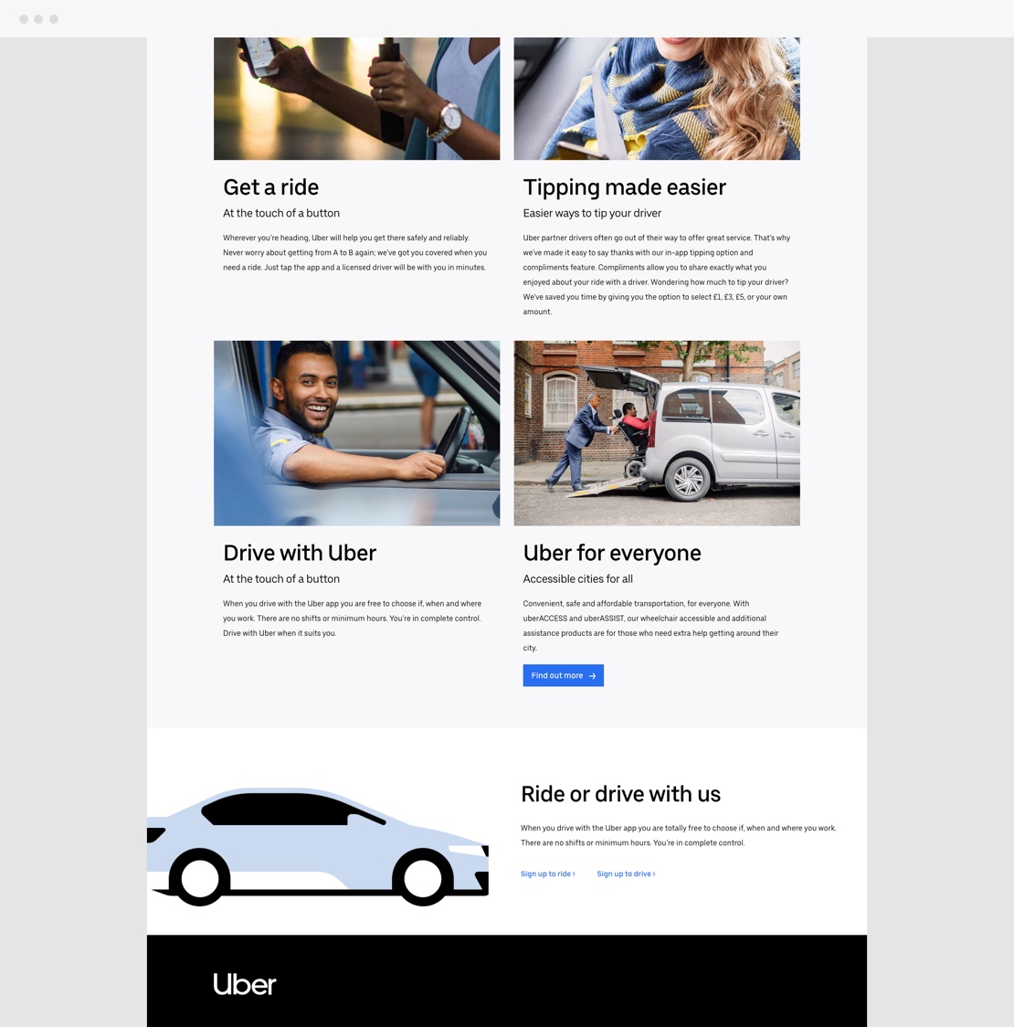

At Storm Digital I was asked to redesign the Uber UK landing page for both drivers and riders, to better meet their needs and improve the overall user experience. This page was one of the first to support the new Uber brand guidelines.
The first step in the design of the page was to create Lo-Fi wireframes for both mobile and desktop. After various user tests with the Lo-Fi wireframes, I was able to translate the structure into the Hi-Fi wireframes (visual design) that were also tested during the process. Below you can find the final product which was later taken into production.
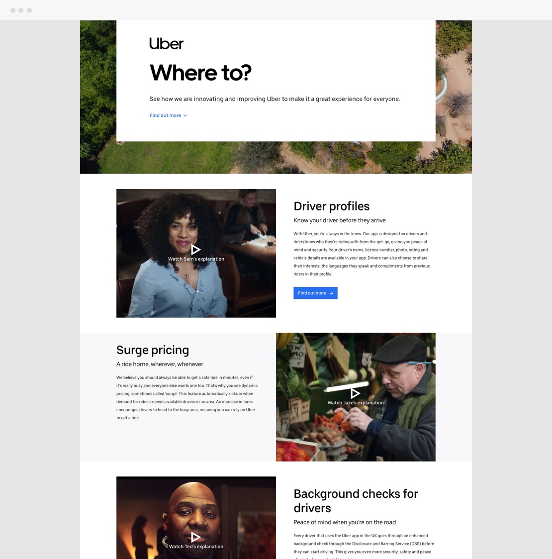
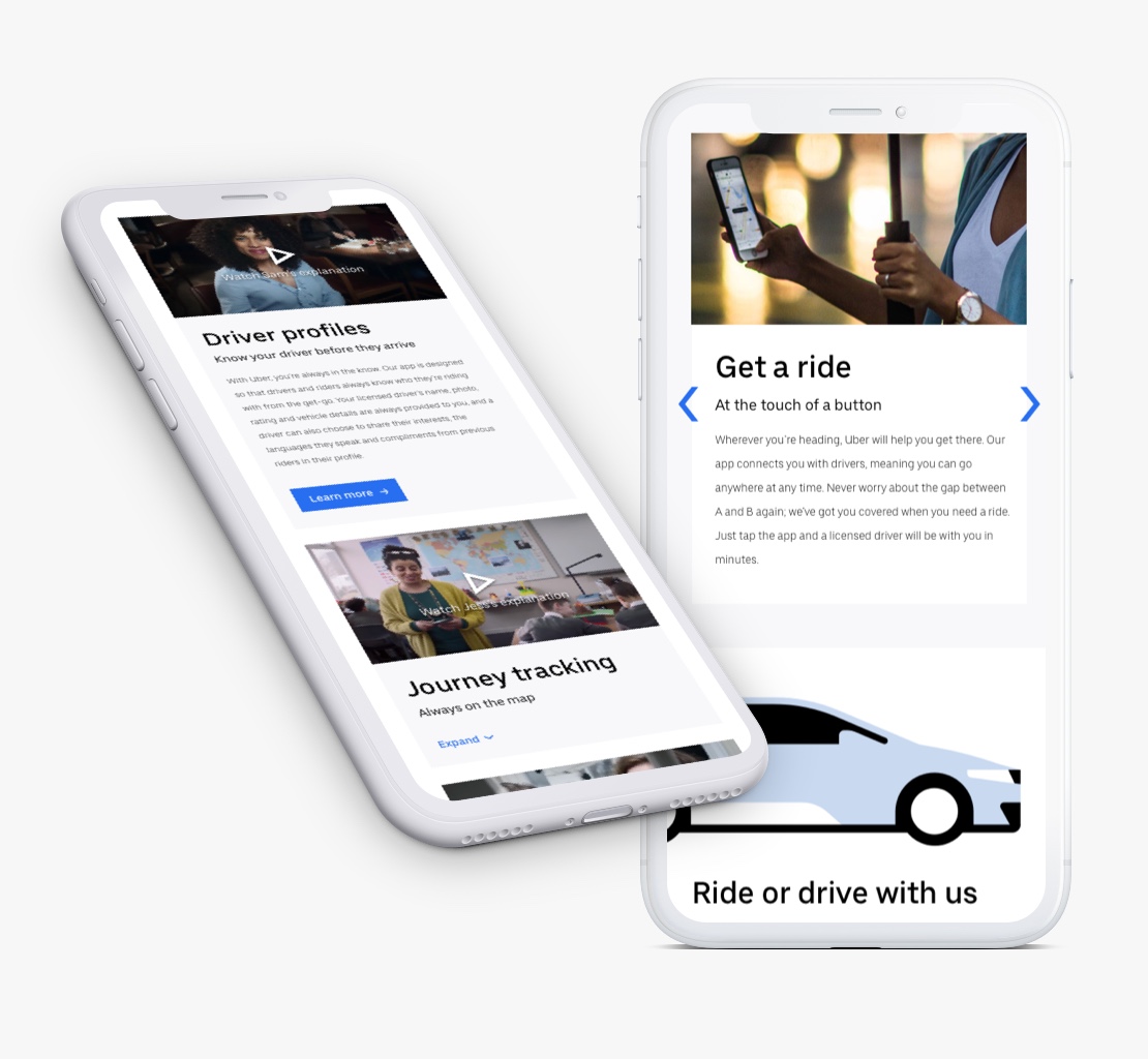


I also created several video loops that play when the user scrolls to the active block on the page. This increases the chance that the user will play the video in addition to the text he / she is reading.
